Friday, 22 January 2016
British values research
thous are the British Values but they can relate to all countries and cultures
 this is a
good and simple design it is eye catching and it gets the message across straight through to the viewer I like the dark edges and the dirty look on it
 this is eye catching but its not good the illustrations look not appealing and very childish and the writhing is hard to read and the image is over the writing and over all it is hard to navigate the design
 nice illustration but it is not too informative and looks childish and its is not very creative and it look silly.
 this shows how about unity and respect but the visual impact isn't grate the faded out map is not looking good to me even that it was intentional with the deper colors where the hands are

 its obviously that the product is sour thanks to the color and the actual image of the face that has a sour look its also funny and entertaining to see I like the idea of it i look very interesting and it is eye catching
 this one is a good one as well a complex illustration with grate color a good joke in the caption line and it advertise the product well overall earthing is fitting in nicely with the design and I like it
 nice simple illustration with the classic Kit Kat catch phrase on it i like it its good nice use of color and lay out of the text and images
 this is nice image with strong massage with it puts it across well and also its simple but creative I like the dark contrast of the image and the illustrations on the face and the hand are good.
 a creative advert of a speaker and the image is subtle and i think that it means that music will wake you up or something like that . I like it it is interesting how the mange to hide the speaker in the mug that you can miss at first look .
that want to increase the living quality and so we can move towards better community
and ill will have to design a poster about it but it can evolve to other media of work.
- democracy
- respect
- liberty
- tolerance
 this is a
good and simple design it is eye catching and it gets the message across straight through to the viewer I like the dark edges and the dirty look on it
 this is eye catching but its not good the illustrations look not appealing and very childish and the writhing is hard to read and the image is over the writing and over all it is hard to navigate the design
  nice illustration but it is not too informative and looks childish and its is not very creative and it look silly.
  this shows how about unity and respect but the visual impact isn't grate the faded out map is not looking good to me even that it was intentional with the deper colors where the hands are
Advertising/ promoting /communication thru art and design
so I had did some research in to advertising for some more inspiration and ideas .
 its obviously that the product is sour thanks to the color and the actual image of the face that has a sour look its also funny and entertaining to see I like the idea of it i look very interesting and it is eye catching
  this one is a good one as well a complex illustration with grate color a good joke in the caption line and it advertise the product well overall earthing is fitting in nicely with the design and I like it
  nice simple illustration with the classic Kit Kat catch phrase on it i like it its good nice use of color and lay out of the text and images
  this is nice image with strong massage with it puts it across well and also its simple but creative I like the dark contrast of the image and the illustrations on the face and the hand are good.
  a creative advert of a speaker and the image is subtle and i think that it means that music will wake you up or something like that . I like it it is interesting how the mange to hide the speaker in the mug that you can miss at first look .
cartoon strip editorial reserche
 I chose this illustration because i like its stile but i also think that it is define to a certain extent I like the slight shading and the interesting stile and it also has a good humor to it
  This is much more simplified stile but it is still appealing and looks good and gets the message across.It has nice smooth lines on the characters nice strong contrast that brings the characters out .
 |
| This one may look detailed at first but when u take a better look u can see the simplicity of it which i think is grate It is made out of simple shapes and straight lines to make a good character design that stands out and is presenting well and works good in a comic |
 I like the stile of this one it is original and looks old school nice natural lines and well presented back ground with minor details and a good character that is in a moving pose making him look like he is ruining i also like the deep think and dark lines that define the character and the background.
  |
| I like the Ruth lines of this one with Cross hatches and the lines and the color going over the outlines on the smoke and the transition in the background between the colors and the comedy of it. I m not a fan of that typical character design looks boring to me but its just my opinion. |
 |
| Is is a common stile that is often seen in news papers its is simple and goofy looking but it fits as it is used for jokes nice use of lines to indicate the shade on the characters and the environment i like the liter green are where the characters are standing bot think there could be more of it to fill the space. |
 |
| This one is classy and i like the classy still of it using simple colors and smooth lines looks good its nice and simple but still good and appealing to the eye maybe some shading would give it a beater impact but i don't think it is necessary for this stile. |
 |
| Again a goofy illustration butt much more developed with more detail and a good use of color and shading looking good the type of shading can be liter bit difficult to achieve using graphics markers but not so much If it would be done digitally. |
 |
| This one is differed and had strongly abounded the relation to a real body form but still can see the human futures i like that stile it has nice Crosshatches for shading and back ground. |
 This one its really simple but works well for illustration and sorry telling if you want to use that kind of simple stile. It could work beater with more shading and if the characters where more similar in the stile i think that they are too different in the facial features for example a nose.
  This one is more advance but it still have some quick rough lines on it used for the shading and the less realistic character fits in nice with the car it has that dark felling to it because of the heavy shading .
  Nice puppet looking character that resembles a human and it would be easy to create a character future with this kind of work i like the deep colors and the simple lines and shapes making this character.
  Old school illustration that is simple but still defined and looking good.nice dark lines defying the characters very straight and controlled lines and a simple design.
  Illustration looks good nice warm colors and it is using fairly straight lines and looks good with out the black out lines which is unusual for an illustration but make it look more realistic in a way.
  a very nice simple illustration but also very good illustration simple but the characters cans stand out.Nice simple straight and controlled lines making a simple shapes to make a nice character i may experiment with this stile of illustration.
 Tuesday, 12 January 2016
personal


i had made this Little illustration I did on A1 paper that I started with painting the paper with blue and a bit of white at the bottom and to make it lighter and a bit of red at the top to make it darker at the top then i did some mountains on the bottom that i had to go over later because i did it with small amount of paint then i did some stars and at the top i decided to add a lite flaying platform of earth with a man smoking a pipe under the tree. it is don with dark shades of color to make it really feel like night.this is a personal work that might be used by me in future projects
3D work life drawing
we draw some of our work from 3D because we didn't had a model this week for life drawing so to make it bit more interesting to do we had used work we had made in the 3D class with different materials i did some painting at first but then i tried something new and i drawn one the skull with charcoal and after painted a shield quickly to use out all the paint after that i cut out the skull drawing and glued it to the painting the shield just to experiment a bit


life drawing
I had decided to use paint for this session of life drawing and experiment with it and use it in new ways so one more i had decided to mix the paint on the paper using the yellow for the light red for light shades and blue for dark shades and mix it all together with wight paint to achieve the skin tone so this means i had to work fast in order for the paint not to dry out . and did it few poses trying to change the way i was working each time to develop my work more.


Monday, 11 January 2016
materials euationval
so far I had worked with few materials in the 3D room creating 3D forms and structures that were interesting and enjoyable to make for the most of them so far I had worked with
clay - forming with clay is an enjoyable thing to do I did some references to the life drawing of skeletons we did it is interesting to use it and you have to be patient to create stuff with it.
clay & wire work I made I don't think I would use it the next project of making a costume but maybe in future for other stuff.
wire and - using wire can get frustrating at moments when you tiring to join it with different wire and it is also more dangerous to the user so protection must be worn. I do enjoy it over all and might use it in this project to make some interesting costume but only small amounts how i developed my clay work in to wire and plaster bandage.
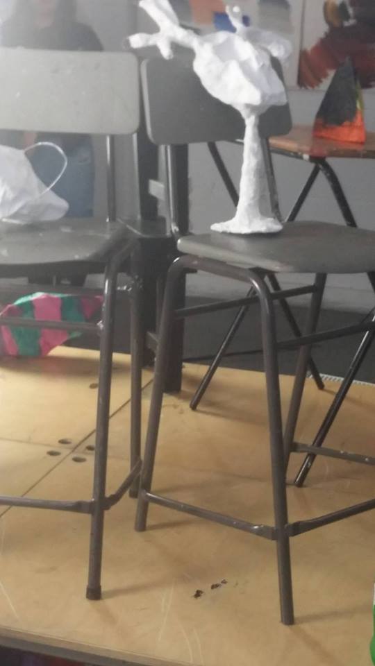
plaster bandage - it is nice to work with it apples on to the wire or and bottle relatively easy and if don right, dries over one night and came of stuff you formed it around and sticks to the wire well I might use it in the costive project enjoy using it (reference in the previous link ) might use it in the costume but small amounts because of the heavy weight.
willow branches - it was a new material to work with defiantly interesting and good to work with hard to manipulate but possible to tight together with string or tape and make an interesting form. my willow creation it would be interesting to se some hint of that material on it
wire mesh and paper mache - similar to work with but it seem bit more stable. I do enjoy it over all and might use it in this project. only negative thing about paper mesh is that it is time consuming to make it and then apply to the wire I might do parts if the costumes with that materials .wire mesh and paper mache will use it for the work
cardboard-we had to do some work to out of a card board to create and standing abstract structure. I enjoyed it can be variable to damage but it can be manipulated easy I might use it in my costume.
most of work did is related to our life drawing.
I relate most of my work to Picasso work and some of over abstract and automatic artists as Basquiat
clay - forming with clay is an enjoyable thing to do I did some references to the life drawing of skeletons we did it is interesting to use it and you have to be patient to create stuff with it.
clay & wire work I made I don't think I would use it the next project of making a costume but maybe in future for other stuff.
wire and - using wire can get frustrating at moments when you tiring to join it with different wire and it is also more dangerous to the user so protection must be worn. I do enjoy it over all and might use it in this project to make some interesting costume but only small amounts how i developed my clay work in to wire and plaster bandage.
plaster bandage - it is nice to work with it apples on to the wire or and bottle relatively easy and if don right, dries over one night and came of stuff you formed it around and sticks to the wire well I might use it in the costive project enjoy using it (reference in the previous link ) might use it in the costume but small amounts because of the heavy weight.
willow branches - it was a new material to work with defiantly interesting and good to work with hard to manipulate but possible to tight together with string or tape and make an interesting form. my willow creation it would be interesting to se some hint of that material on it
wire mesh and paper mache - similar to work with but it seem bit more stable. I do enjoy it over all and might use it in this project. only negative thing about paper mesh is that it is time consuming to make it and then apply to the wire I might do parts if the costumes with that materials .wire mesh and paper mache will use it for the work
cardboard-we had to do some work to out of a card board to create and standing abstract structure. I enjoyed it can be variable to damage but it can be manipulated easy I might use it in my costume.
most of work did is related to our life drawing.
I relate most of my work to Picasso work and some of over abstract and automatic artists as Basquiat
Friday, 8 January 2016
2D to 3D
we had researched Picasso work that had been made in to monuments that was made on big scale with hard materials i had to do some abstract work resembling life drawing and i came up with this after trying out some sketches after doing that had cute it out to see it it will be able to stand the did the same in bigger scare in card board citing with blade (in safety gloves to reduce the hazard)
and in the places where it bends i had slightly went down with a blade to make it bend easier


and in the places where it bends i had slightly went down with a blade to make it bend easier


abstract forms
 I had to work with wire and tissue paper to create an interesting form refereeing to our life drawing of skeletons and different futures of the bones structure so i had formed a pelvis looking shape with a thicker wire and the i don pointy things resembling ribs and also some side bodes that i had attached by twisting the wire around the thiner wire around the thicker one .


Subscribe to:
Comments (Atom)