Showing posts with label year1. Show all posts

Monday, 4 July 2016

ilustration

need more work with paint skills the colors seem flat and not fave
more depth to it and also the shading isn't grate  
I also did a illustration as it was one of my interests however I need lots of work to be any good at this part of art illustrations a usually very well colored and well polished as they represent a animation a movie or a game and are usually finished to a very high standard.

so as the subject mater was human form in the constructed environment I decided to to a lady standing on a hill and there is a city in the back with lots of wires connected very where representing human nerve system or blood wains so  its all connected like in a body

in the first a tempt i simply  sketched out the out line of the city and the lady and than painted around it and the tried in filling in the city and lady which did work well so for the second attempt  I did it layers so I had painted the background and then make the other futures on it which still docent satisfies me so I will upload the image to photoshop and maybe ad some more colors
the colors where much deeper after I gone over it in illustrator
as it easy for me to control the color on Photoshop than wit
paint as it is unpredictable 
I added the wire post and the wires are nor strait and squiggly
next time would do it I would  learn how to use some kind on
tool that will help me have that nice curve 
the electricity in her hand and on top of the tower look good
and I am happy with that part of the illustration its,I simply had
colored it on  
 so I did imported the image in to the an using the same colors that where on the painting i had painted over the painting with the brush tool and i also redrawn the walking lady and added a hint of fantasy to it with her having powers and i also added power lines. the illustration turned out ok but not amazing I would need a lot of practice to to get closer to high standard professional work they is accepted in the industry unless I go for more easy to draw stile for me

Animation Research

Harry partridge is a talented animator and a artist that some interesting and for some people offensive and too exposed at some parts. I am a fan of his work his stile is very professional his work looks like some think from high quality studio nice smooth animations with well design characters with smooth lines making the images come alive and seem to have character and it also has very good coloring 
A nice image with nice shading it look very good in the animation with
smooth moment and transition. 

I like that the animations are bizzare and funny a mix of action and
comedy  with random creatures and wired reactions from the characters 
He even has a series thats he works on that has a intriguing story
with nice movement of the characters 
some of the animation are parody of games and giving them
a good sense of humour and like always great movement
illusion  
he also do some music animations with some amazing
lip sinking with the worlds he was saying to go along with
the animation 
as you can see in this gif the animation is smooth and clan
i like looks good even tho the Thor is still it looks alive with
the other character is still looks a live.

Jazza is also a animator with some impressive skills of drawing and animating  with amazing shading abilities making the drawing look very real and 3d giving a good idea of depth and distance
a nice image showing human forms it has the proportions about right
and it has that nice cartoon look 

a nice design work showing how he builds his characters with
out any detail and how it is being gradually build it allows you
to work on you character and make them look as good as possible

a nice simple movement example bettween the images with a
nice simple character that is interesting and creative 


a good face structure example good use of guide lines and
trying out all the different expressions of a character and
seeing how it would work 


also a good example of body building and the proportions oh human body and
how it could work in different positions and and preforming different actions
to see how it would work in a animation 


Friday, 1 July 2016

national geographic book cover

For this unit I had to make a cover linked to the national geographic books, so this would include the layout of the book, the borders, text, font, space, cover used etc.

To start making the cover for the book I got pictures taken of me with a college camera and a film light, the light would help the pictures come out better and highlight parts that weren't dark, I would use the pictures I took and wanted onto my cover.
An edited version of a photograph, adjusted the brightness and
added a blue effect
The original version of the picture with some adjusted brightness
With the photos I would then edit them on photoshop with filters and effects so they would look different and even change the quality of them, I mainly adjusted the contrast and brightness on them before adding on filters and effects like glows, smudges and blurs.
With the effects of the photograph done I moved onto making the layout of the Nat Geo linked cover in illustrator, following instructions I was given with measurements of what size to have the borders and text, what font to use etc. along with what effects to use and what percentages of opacity to use.

A slightly edited photo, adjusting the brightness


A cover that I'm happy with how it
turned out with its 'ghost' effect


For the layout I was given instructions of how big the border and text was going to be and what kind of font to use, so I first did the border before moving onto the main title text which would be in a New Times New Roman font, the sub-title text also being in this font but as a smaller size.

An overall screenshot of the illustrator file when I was making
the cover and adjusting text and the adjusted photo

I started editing and adjusting the photograph where I have my hand stretching out towards the camera, though there were two versions of this, one where my face was visable and another where my dreads were covering my face. With these two pictures I overlayed one over the other and changed the percentage of the opacity of the photo where my dreads where covering my face, giving this cool looking 'ghost' effect which I also thought looked professional.


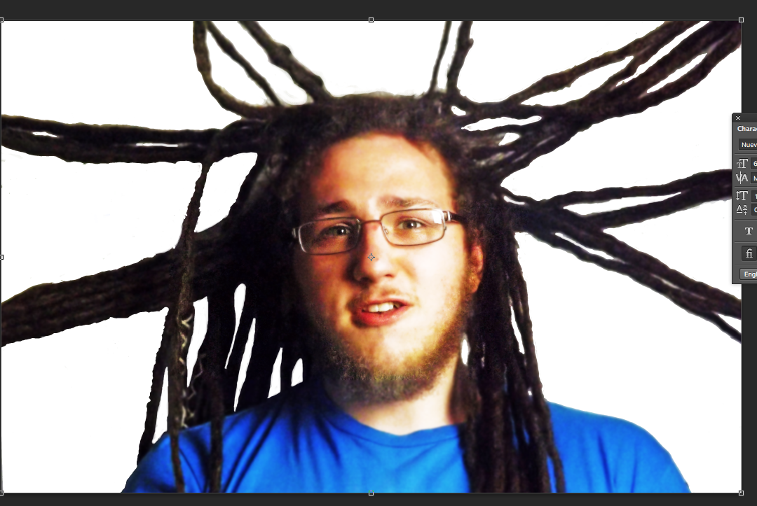
I then started working on another photograph I had taken where my dreads were being held up in different directions by other classmates for the photo, I thought it would turn out quite cool and different, though it had caused a problem.
When I looked at the photo where my dreads where pointing up, it did not look very professional or how I wanted or expected it to look like, the way this cause a problem was because cutting it out in photoshop was quite difficult to do, I tried with the auto select tool but it wasn't working properly by not selecting everything or selecting stuff I didn't want included, so I did it manually with the pen tool instead.

The cut out photograph did not look very
professional with it sitting at the bottom of
the cover
A better version of the cut out photograph,
stretched out without being distorted to
fit the cover better


I saved both the cut and uncut version of the photograph and tried them both out on the cover, but due to the size of the photograph the cut version looked out of place and unprofessional by sitting at the bottom of the cover, and I wanted to avoid stretching the image to fit the cover since it would become distorted, though I did increase it's size so more of it would fit onto the cover. The image wasn't tall enough to fit the cover though I did try to stretch the image a little bit while trying not to make it disproportional, it worked OK and didn't look too silly, though it could have been improved but I did not have enough time to take new shots for the cover that could be better planed out and better looking.

A different photo I used and put onto the
cover, which does look better


Because of this problem I used some of the other images I had took and manipulated them in photoshop as well so that the are interesting to look at and close to professional looking, then transferring them onto the illustrator file of the cover and adjusting its size to fit it.

An overall screenshot of my work when adjusting the the cut out
version of the photo where my dreads where being held up
The un cut version of the photo adjusted to
the covers size
                                                                           

The cutout version adjusted better on the cover
so it wasn't stretched and disorted
 I tried again with adjusting the both versions of the cut and uncut photographs file, without stretching it too much that it looks disproportioned, to fit the whole page, they didn't look that bad at all and I think it worked well. I think that the completely white back ground with the cut out version of the photograph is not as good as the uncut version of the photograph, the shadows and background shapes and bits seeming to fill in the space and look quite good. I think that the image works well and it's interesting and not boring.

Overall I'm kind of happy with how stuff turned out, some of them a bit unprofessional looking and frustrating to do, this being the cutting out of the photo, but others seemed to actually fit the cover and look quite good and interesting, this being mainly the uncut version of the photograph.


Thursday, 30 June 2016

national geographic

To get some better designs i had to do some resercz in to the covers of the national geographic for the project on making a cover in national geographic stile with image of our self and our own title and get the idea of how would my cover look
a nice cover with to images over laying each over
the image of Jesus is bit distorted and the image of the camera
man is more high definition .
A nice image of two people holding pigs
nice and clean image , although I don't
like how the mans head goes over the
text and it covers it.
This is a impressive picture of a parrot in the
wild consuming a froot the camera mad must have been
very lukcy with his timing ,the image works well with the text  
A image of a man from a different culture can
with a clean one color back ground however the
image is not very interesting. 
A nice interesting image under water with a
human around creatures of the see looking cool and interesting
and eye catching so its decently works on a cover .
another interesting image of a of a girl with a
puppy inside her coat works well with the text and
it can draw attention to the viewers. 

Tuesday, 28 June 2016

poster designs

One of the first designs for the banners I made
 So after taking some photos of different objects and structures around the the art department I downloaded the images to the computer and manipulated the images in Photoshop using the classic 3 tools that should be used on every uploaded picture (levels, curves, selective colors) it makes the picture look better with deeper colors and nice contrast

We had made a template for the banners to make some interesting designs on them in illustrator after editing the pictures in the Photoshop I was trying to make the image eye caching and not overloaded with useless information just simple art and design text that stands out and that it works well with the
design.
An overall screenshot of my work while I was experimenting
with banner design

Banner designs with inverted and colour adjusted photographs
I have taken
A banner design further developed, one having a
repeated pattern on one banner and an added text on
the other

I like this design it has nice palette of colors that contrast with
 each other well and the text is nice and smart looking 
This is a image of some old papermache work that I found out the back it might not looked appealing at first but after some image manipulation it became an interesting image I needed to add some  space for the text so that it is nice and visible and is fitting in with the design.  
A design I thought of, one being of a photo and the
other of a design I made in illustrator
A further developed design where I used the illustrator
based design on both of the banners but with different
colour palets, looking professional
The developed banner designs with the NNC logo on the
bottom of both of them
 For this design I did simply using the line tool in illustrator and after that i filed the spaces with color I got inspired by one banner i seen with some wired shape  in the edge of the banner but my look more like a statue of a face  I think that the back ground looks a bit plain.

A design where I used a photograph on the 'inside' of the
illustrator design, giving a cool effect and professional look
 Also to make it image more interesting I added some lines on a different layer and then using the clone stamp tool I had transverse the pastern of the paint thrown at the wall that students did couple weeks ago i was surprised with the out come.
The picture is of an inverted picture of a paint
splattered wall his poster design also be used on banners


An overall screenshot of my work when I was working on a
poster design
A design where I had the text on the top and bottom
of the wooden stump and the & in the middle of it
The text on the poster curving at the bottom
of the wooden stump
  These pictures of a tree/wood stump stood with a grid on it next to the sidewalk that could be a promoting poster  and i had changed the image making the colors deeper and making the contrast bigger to achieve this color I had problems with with the text as the color of the image has different shades across it making the text difficult to read and make it stand out but I will experiment with it more changing the lay out and color of the text.
I had changed the text color to red as it seemed to
be the most visable on the poster.
I moved the text to one side to see how it would
 look when its more compact 
I changed the & symbol to and, placing it in
the bottom right of the poster
I tried out a couple different positions of where
to put the text on the poster to see how it would
look and if it would be visable
I like this design but looking at it now I think
 that it would've been better if I had placed the text in a 
different corner, like in the top left for example 

I tried out a design where I used the same inverted photo
design on both of the banners but flipped
A screenshot of my development of a design I was trying out,
changing the overall colours of them and using the bucket tool
on the bricks of the wall 
I tried to do something artistic with the  the brick wall by adding some colors and effects to make it interesting and eye catching i used fill bucket to place the color over the bricks or between the bricks and it made a interesting effect i might still use this design but it didn't convinced me.

I tried out changing photos to having 'main colours',
some had some interesting colors but I don't think that it 
would work well on a banner or a poster 
I like the purple and white contrasting with the green 
on this design, I think it has potential but it seems too
 dark and not that welcoming for new viewers 
Another experiment with colours I did with this
photograph, but I don't think it would be suitable
as a design
 I also did some experimentation with different pictures i did inverting the colors and adding some filters which had potential for a part of a design but not a one whole thing.  
I am working on making some kind of paint brush statue or something that would relate to art that i could use in the design to make people interested in the banner 


A design I tried out, a detailed colourful photograph on
one of the banners and a more simple design on the other one
A photograph I edited and adjusted with its
brightness and contrast
I like how this design looks, the text is visable and shows off
a colourful detailed photograph of a paint covered wall, making
an eye catching effect
The design with two large red corners added onto the top left
and bottom right, helping make the black text more viasable
and also look more professional
   I also did a design for a leaflet that people could look at and read i simply used a enhanced image of the picture i took with some test on it and some red areas to to make the text more viable and i could experiment with that a bit more.


A quick design I tried out which surprisingly
looks quite intresting and cool with the angle
of the photograph
  This is a nice design it reminds me of a book cover it wasn't hard to make its a picture with simple image enhancement such as curves to increasing the contrast and selective color to make some colors deeper than I just added the text and the logo and placed them in a good position.