We had to design a student hand book NNC that would be appropriate for the right audience and drag team to wards it we haw to do minimum of 3 designs.


 Before i started i had did some practice samples with placeholders pictures to see if my idea will work well and also use them as a reference


 Before i started i had did some practice samples with placeholders pictures to see if my idea will work well and also use them as a reference


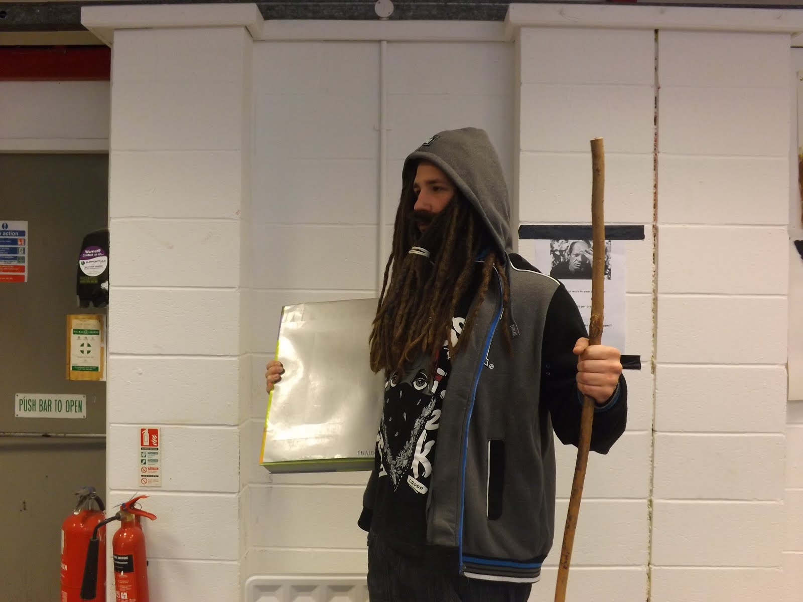
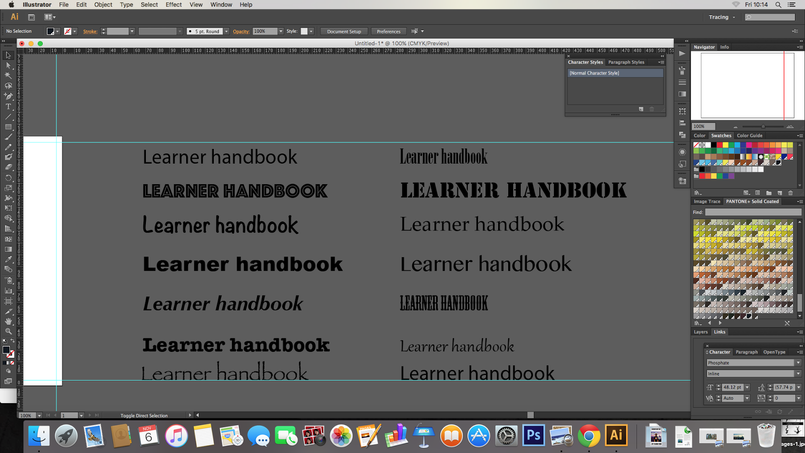
For the first one we used photography so had to come up with some ideas for it. I did some sketches to see how would it looks and decided that thing that i associate with knowledge and books is a wizard. So i grabbed a stick and a big book pulled my hair in to a beard and took multiple pictures to have bigger range of work i also did pictures of outdoors for some background. After i downloaded pictures to a Mac and selected ones i want to use i imported them to Photoshop to enhance the image i changed brightens and contrast of the image using different adjustments options on Photoshop,such as curves,selective colours,hue saturation,channel mixer,exc. I cut out the image of me and superimposed it on to the enhanced picture of some trees. I dad changed my hair colour to grey by desaturated the selected parts and a after increasing contrast. I had used the clone stamp tool to change the texture of the sleeves on mu hoodie to make it all have all grey tone of the hood. Then the layers been copied and merged and placed on guide lines i made before. In illustrator i had experimented with different type stiles and colours until i had decided what i want then it been placed on the image saying "Student Hand tome" along with college information ,year and college logo.

 I experimented a bit with different effects to she different potential of the picture






Then we had to create a different design using Bauhaus for main source of influence so after researching Bauhaus and getting all the references i had to create a design i went for the sharp shapes design that would bi pointing to a person in glasses also coming up with funny long name for it "A book that student needs to be safe and well at North Nots College ". At first i made some shapes using pen tool that would all be pointed to middle of the front cover where the was a person in glasses illustration in Bauhaus stile in the b letter tilted sideways and i made the title go around it
using tip on path tool then added the information and college logo and year using Bauhaus tip stile.


some more experimentation i did with bauhaus design i did

then we went ahead and decided to work with some illustration and doing very expressive work and automatic work on paper working with paint relating to jean Michel Basquiat then taking the picture of it and then import it to photoshop and improving it's colour and sharpens and using a smudge tool as well then selecting good type stiles on illustrator and importing them to the picture on photo shop
i did some of experimentation with the back and the least expected to do good was a smug toll but it did well and became final one


this is an extra one i made. It is an amazed person that is overwhelmed by the power of the book of the NNC college book. I had separated the picture to different layers to work around them increasing lilting on the face so it looks like the book is emitting light that why i also added beams on sides then i had to clean out the book and make it blank i did that with an clone stamp and then had changed the color of it with color saturation tool to change it then after testing different type stiles i chosen one and imported it in to the file


using tip on path tool then added the information and college logo and year using Bauhaus tip stile.


some more experimentation i did with bauhaus design i did

then we went ahead and decided to work with some illustration and doing very expressive work and automatic work on paper working with paint relating to jean Michel Basquiat then taking the picture of it and then import it to photoshop and improving it's colour and sharpens and using a smudge tool as well then selecting good type stiles on illustrator and importing them to the picture on photo shop
i did some of experimentation with the back and the least expected to do good was a smug toll but it did well and became final one


this is an extra one i made. It is an amazed person that is overwhelmed by the power of the book of the NNC college book. I had separated the picture to different layers to work around them increasing lilting on the face so it looks like the book is emitting light that why i also added beams on sides then i had to clean out the book and make it blank i did that with an clone stamp and then had changed the color of it with color saturation tool to change it then after testing different type stiles i chosen one and imported it in to the file


