Saturday, 21 May 2016

What I like art wise

So we had to work to see if the subjects of art we think that we want to go towards is right for us.
I want to progress as an animator/storyboard artist/ illustrator/character creation in my art carrier 
and so far doing stuf that is involved in it is good to me I enjoy creating illusion of moment  it is rewarding to see your drawing come to live. I also enjoy coming up with all the different ideas for interesting characters and story lines.

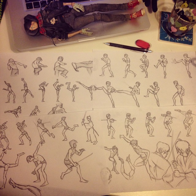
So I did and drawing which was an story board in a way because it will guide me in a simple animation i am planing of making bunch of figures run up and take a pose to form a structure.
If i had to do it again I would do the human form with a litter bit more detail and make them have better proportions.  

I Photo copied  the drawing i did to experiment with paints and different stiles and ways to enhance the image    
I aded some shades of gray between the body's and also coloured
some in to see how it works i was not impressed 
I filled the negative spaces again but with much loser and
uncontrolled stroke using neutral greys again didn't work well 
  r
I try to blure and spread the paint and i was hoping that the figures wold shine thru more showing me a interesting image but i failed i would try  to use water paints next time.

  I thought making a Plasticine model would be good reference and practice to creating clay model for 3D scanning which is also interesting to me   the colors from the Plasticine on the paper looked interesting

Thursday, 19 May 2016

Making a cover

The layout and design of the nat geo based
cover
A photograph I edited by adjusting the brightness and contrast
An original photogrpah that was took of me with classmates
holding up my dreadlocks
 We had to do a project to make a book cover in National Geographic book style with the picture of ourselves on them. So to do this I had to take some shots with a camera of my with help of my class for some of them i had taken many diffident pictures to have a big amount of them to choose from. I selected 3 images that I wanted to develop, edit and put onto the cover based on the National Geographic books

An edited version of a photogrpah with a blur effect/filter added
To do the layout for the cover I had to measure out the borders to the right diameters from an actual nat geo book we were given, then, moving onto the illustrator file I used 'rulers' in the software and guided lines to make sure the measurements were correct when making the borders and text do they would all be in the correct space.
Then I had to manipulate the images and visually enhance them in the photoshop software using the standard techniques to enhance the image, by using the 'levels' option to bring out the colors, using the 'curves' option to change the contrast, and 'selective color' to take out any unwanted color from the picture.
After that main overall editing of the pictures, I had to work on enhancing my face and making it smoother and more ascetic, so by flowing a work sheet I had duplicated the layer 2 times then change the opacity on one of them to 60% and to 40% on the over one and the lighten blur on the 60 one and darken blur on the 40 one. Then I added the glassware blur filter to bout of them and merged the two layers then using an eraser I removed the blur from some facial futures like eyes to make them sharper. After that i had to remove the back ground using magical eraser and added a white back ground
An edited photograph with the brightness and contrast adjusted
along with a small blur effect
The edited photograph now cutout from the background by using
a quick select tool

Then I did some experimental work with all the different effects, most of them where mainly for experimenting so I could see what effects they do and what they looked like, but there were some that actually looked interesting and that I might've used
.  
A heavily effected version of the photograph with a shadowed
black and white filter on it
Another heavily effected photograph with a shadowed black and
white filter

Friday, 13 May 2016

British values

So working on the the British values is difficult and can be confusing and its hard to not be stereotypical and still create a high quality of work. At the being  we had to do a template in the right shape and download the logo to it  to place it on the poster design and also I sketch some Union jacks in different stiles with and with out color then i decided which one I want to us then using a scanner I scanned the image to my computer  enhanced the image in photo shop (changing the levels so the colour is more alive  selective color increasing the reds and making the whit be more white also increasing the contrast with the levels option ) then the image was placed in the poster template and adjusted to size .

 To get this idea I went true a developed process so from my research I seen that there are many different kind  cultures and  races all together when I searched Equality so I decided to start of with that but it was not to good or creative eggnog for me so I decided that chest would be a good idea but after developing it I thought that it is associated wit war by many people so I wanted to avoid that and so I decided to simplify it by making it in to different shapes that i decided to make a different size as well and nice easy to read type of fount under the image. 

  For this design I took a picture of a vending machine because I thought ill be showing that British people ain't supper sassy about there tee and get it out vending machines  and just drink it casually and its nothing special people just like tee. At start i had  took a picture of the vending machine and using a pen tool a made a simple outline and aded a bit of art deco stile to it. 

  Then I decided to make it bit more pleasing so I thought that that making the vending machine be in a distance to make it seem even less important in British culture it also look a bit like a way to freedom


I did test out some different ways of expressing the way ti freedom by trying different shapes out using the shape tool and the lie tool to make tunnel looking structure.
But having them images close had made m think that it could represent tolerance as well it works ok but I don't thing that it is not eye catching maybe it needs full colors or thicker lines.
 coming back to way to freedom i thou of stairs  and how it progress to it shows that it is a journey. I am also thinking of punting the world of each British value on each step .

Monday, 9 May 2016

new cv

Marcin Ordon 
04/04/1997

Mobile - 07856 378924| Home - NA | 10 Dennis Street Worksop /Nottinghamshire/ S80  2LL

PERSONAL STATEMENT
I see myself as a person who is confident to be part of a team, an organisation and the roles within it.
I take pride in my work that interests me, I do believe I have high creative potential and I always prefer to make sure that the work I produce is to high standards. I am a very creative person, always having ideas to share and develop by myself or with a team, I always want to develop ideas to see where they can end up. I always enjoy creating content, though is normally based in sic-fi and fantasy genres and areas, but I do try and successfully explore all other areas and genres as well. I am a calm and focused and always open to others opinions and take effort to understand them understand as well as sharing my own opinions in a professional manner which successfully helps me to comunicate with a large range of different kinds of people.


KEY SKILLS

TECHNICAL SKILLS
Idea development 
Character design 
Story development
Flash animation programs
Illustrator program
Photoshop programs in editing/drawing/colouring 


PERSONAL SKILLS
Creative 
Focused 
Organized 
Great listener
Quick learner 
Calm    


EDUCATION

sir Rdmund Hillary school Primary School, Worksop - 2004 - 2007

Valley Outwood Academy, Worksop - 2007 - 2013

North Nottinghamshire (Engineering level 2 ) Worksop - 2013-2014

North Nottinghamshire (Art & Design Level 2) - 8th September - 7th July


North Nottinghamshire (Art & Design Level 3) - 16th September - Present
  

QUALIFICATIONS 

English – E
Math – C
Science – Pass
ICT Internationals – Pass
Art – D
P.E - Pass
Engineering - Pass
Art, Design & Media - pass


EMPLOYMENT
BNQ warehouse  
Green core 


PERSONAL INTERESTS


I like to play games of all genres either solo or in a team. I enjoy sports such as rugby, hockey, basketball and boxing. I find the history of prehistoric and  medieval times interesting, especially art wise, seeing how art has progressed over the years. Im interested in all kinds of cultures all over the world. I am interested and passionate in animation and the whole subject and development of movement, I'm always intrigued by different types of handcrafts such as blacksmithing, stone and wood carving.

Saturday, 7 May 2016

area of interest recherche

Anna Cattish is a comic artist and a character designer
http://www.annacattish.com/


Bea Esteves is a chcaracter designer and visual development artist
https://www.artstation.com/artist/beaestevez
http://beasketches92.tumblr.com/


Barbara Fisinger is an illustrator, character designer and visual development artist
http://barbarafisinger.tumblr.com/
http://barbarafisinger.blogspot.co.uk/


Benjamin is an Goblins animation,character design, visual development and story boarding student.
http://benjaminwarnitz.blogspot.co.uk/
http://benjaminwarnitz.tumblr.com/
https://vimeo.com/benjaminwarnitz


Film designs links with area design  I see the similar way a film designer would work like character designer
https://www.instagram.com/p/BFE2-JRSfcJ/

graphic design
https://www.instagram.com/p/BD7tiUwkx-1/?taken-by=allyoucaneat_ntu
 

Saturday, 23 April 2016

costume

to make my costume for the catwalk I had to do lots of experiments and designs to make the final peace. I started of with sketching out  couple ideas on making my design linking in to human form and constructed environment so I tried some body extensions and such other features parts that can stick  out and represent constructed environment.  from my very first sketch I knew that I want to create shoulder pads that that would be the key future for the constructed environment or human body I also planing on creating a head peace. for the hands I thought I could do something like a city wall or something like that I also want to ad a cape to cover up any things that are at the back like stripes or other things that can be supporting the rest of the costume that might need support to hold them up right quickly thought of some kind of tower shoes but there is no time to lose so i have to get to experimenting and working out what will work for the costume.


I knew that making the shoulder pads will be the most difficult part of making the costume, to began wit I made a simple and rough tower with wire mesh and cowering it with plaster bandage I had mad a dent in the boom part to fit on to my shoulder better  after it dried I made some padding to protect my sounder then I added some straps  to support it on my shoulder however the structure was not stable eggnog and I had to think of something different. so I decided to do a cast of my shoulders that  would build on after do after I made the cast of my shoulders using plaster bandage I had reinforced it with wire so it had more strength to it so it could hold the construction I was going to make on top of it.After messengering out the straps I had cut holes in the cast just before the wire I had putted in the cast. Then I had used my knowledge of casting betels that I obtained in the level 2  so I casted two parts of the bole and I casted a bottom part of a bucked for the top part of the watch tower I was going to make after it all drayed out I had connected it all together with plaster bandage stripes and then I had connected it to one of the right  shoulder cast using more plaster bandage then I cut out some rectangles at the top of the tower  and for the left shoulder I had casted my left arm that after I attached on the shoulder cast and they bough seem seating stable on my sounders. to paint them and make them look more like they are made of concrete I had  mixed paint with sand and a bit of glue to have more interesting texture.


Unforgettably making the shoulder had took majority of my time so I had less time to experiment with other materials for rest of he costume but i manage to great leg attachment that were meant to represent the constructed and manipulated gardens by cuting a bit of fabric and hot gluing some tissue paper to it and ting it to my legs. I also made a simple top  that I made using Sewing Machine then I had attached a peace of dark blue fabric as a cape which was a body extension as well as it was a background  that would contrast with the constructed environment. I also managed to make and belt that was meant to represent cairn lifts lifting logs but I didn't have time to figure a way to support them up so they didn't look as good as I would like it to.

Over all I was happy with my final creation I like the shoulders because the most as they are the main structure of my costume and are a vocal point  however if I was to going to make it again I would
make my design easier and not as brave so I would have more time to make the rest of the costume more interesting and good looking